Usage Data Dashboard

While at Wiley, I proposed and developed a tool to better collate, update, analyze, and present usage data for publications across the Life Sciences division. The publications I worked on, and most other Wiley Life Sciences publications, used about six different internal and third-party sources for usage metrics. “Usage metrics” in this case was broadly defined to include most measures of success, including pageviews and downloads, submission and acceptance rates of articles, and social media presence. This information is typically presented annually to the Editorial Board Members outside the company, and, in the case of the publications I worked on, analyzed internally on a monthly basis. This is a time consuming task that most editors at Wiley perform.
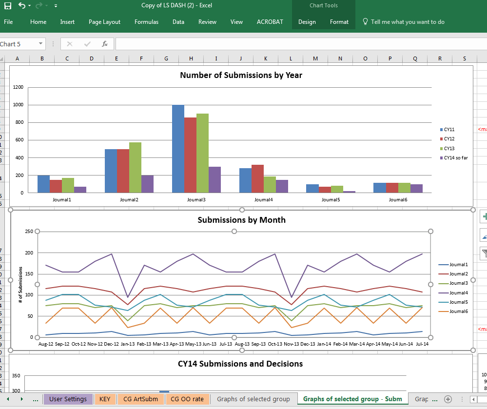
I used Excel to design a tool that would streamline this process. In the planning stages and throughout the process, I consulted with as many end-users as possible to ensure I was addressing the correct problems, and that my solutions would be as intuitive as possible. I designed the Excel document to accept the raw xml outputs of the various programs, and then pull the raw data into other, manipulateable tables, to make updates as quick as possible. The user could then select a pre-set or custom group of publications, and generate all of the charts they would need for analysis or presentations, with each of the charts being automatically updated in scope to match the current date.
While Excel is not an ideal tool for this task, it was the best tool I had available prior to studying programming. Data manipulation, data analysis, and other work in Excel were already among my favorite responsibilities while at Wiley, and the opportunity to build this document was a definite highlight. Reflecting on this project was a big factor in my decision to pursue a career in Computer Science, and to learn the best tools and methodologies that are available.